What every developer should know about image compression

Introduction
As images continue to be the largest part of webpage content, it’s critically important for web developers to take aggressive control of their image sizes and quality in order to deliver a fastest loading, responsive site for their users. Hitting this sweet-spot is not free; you can automate a ‘good enough’ value most of the time, but for the best savings, you need to test quality levels using your human eye. This article will provide a bit of reason, history, and technique to understand and properly address image compression issues for your website.
TL;DR : Image Compression Checklist
- Compress Images with the right format at the lowest acceptable quality level
- Hand-tune (where possible) your compression quality for all images
- Automate the rest to get the best performance
- Investigate using WebP for all your image needs
- Save your images with progressive options to improve user perception of your pages’ load times
- Investigate other interesting ways to get better compression, or transparency. Think outside the box!
Why Small is Big
Simplistically, larger pages inevitably take longer to load. There’s an unending body of research that shows that users of slow sites, spend less time on the site, click through less, click fewer ads, and spend less. Small sites, like AutoAnything, cut their load time in half, and saw revenue grow by 13 percent. And large sites, like Amazon have shown that for every 100 milliseconds of slowdown, they experienced a 1 percent drop in revenue. And let’s not forget that the 2012 presidential campaign based its entire fundraising success on making their website load instantly.
What’s worse is that users have to pay to download your website.
While bigger pages hurt performance for desktop users, too, the biggest victims of page bloat are mobile users. Not only does a 1MB page take forever to load, it can also deliver a nasty shock when you get your phone bill.
Even most ‘unlimited’ data plans for mobile, aren’t truly ‘unlimited free.’ Most of them will charge a flat rate for access up to 2GB or so, and passing that amount can cost more money. Not to mention that there’s many areas of the world without these types of ‘all you can eat’ billing plans, where cost-to-download information is a serious concern for users, as a research paper by AT-T highlighted:
mobile data traffic cost problems are severely hindering the use of mobile services on handheld devices today
…
It was interesting that users try to understand the billing rules even when the carrier does not provide this information. Based on connection indicators, information visible on the phone bill, and previous experience on data traffic billing, people create a perceived billing model that affects their mobile browsing usage patterns.
The folks over at mobiforge provided even more context, putting the entire argument in terms of costs:
AT-T charge as much as $19.97/MB for roaming data in certain countries. Taking some of the examples from Guy's spreadsheet, and using the AT-T roaming tariff, is a peak at 1pictureaday.com really worth $178? Do you really need to visit thenextweb.com for $44 or vogue.co.uk for $65? At $17 microsoft.com is a relative bargain.
For roaming users these page weights are prohibitive for all but the most essential tasks.
Big Images are a big problem.
We can see the the largest increase in sizes come from images which can spell bad news for mobile, where a picture literally costs a thousand words.
Inappropriate image formatting is a common performance culprit. Images being too large, not compressed enough, or having a quality setting way too high can all lead to these images being bloated and oversized which has a direct impact on the loading of your site. Picking the right compression method to yield the best results is easily achieved by getting to know what’s going on under the hood.
Types of compression algorithms
There are generally two stages in an image compressor, a lossy phase, and lossless phase. Lossy compression algorithms will modify the source stream such that you lose information that cannot be restored upon decompression.Most lossy algorithms in image compression take advantage of how the human visual system works, often removing information that we really can’t see, and in the process, saving bytes. For example, limiting the colors used in an image; fewer colors means there’s less data to run around. Generally, when you save an image in a format supporting Lossy compression, you’re asked what “quality level” you’d like for the image, effectively, what you’re choosing is a scalar value which trades file-size for image-quality. Savvy web developers realize that there is a sweet-spot for images, such that the quality level is high enough, and the file size is low as possible.
|
|
|
|
|
|
Figure 1 - An example of lossy compression. Values are quantized to the smallest multiple of 10 they occupy. This transform cannot be reversed.
After a lossy compressor, a lossless variant is then applied, that is, the data, once uncompressed, is restored to it’s exact state, before compression. These are typical compression algorithms that allow the source stream to be recovered directly without any loss of precision or information. In Images, popular Lossless codecs include LZ77, RLE, and Arithmetic encoding. Lossless compression algorithms are the backbone of compression, often squeezing out the last percentages of data from your content, constantly struggling with information theory to reduce your data sizes.
|
|
|
|
|
|
Figure 2 - An example of lossless compression. Runs of values are encoded as the symbol followed by the length of the run. We can properly restore the origional stream. Note that if the length of the run is <= 2 characters, it makes sense to just leave the symbols alone. You see this at the end of the stream with ‘bb’.
Image Formats
An image format typically chains together various lossy + lossless algorithms to grant compression savings. There’s multiple formats adopted by web browsers, each with different features and performance tradeoffs. To be clear, there’s not a “one size fits all” format for the web (currently). Different types of images should be encoded into different formats depending on what type of image it is, what the browser supports, and what needs the page has.
There’s typically three decisions that go into the choice of an image format for a web developer.
- Does it need transparency?
- Does it need animation?
- Does it need high quality data?
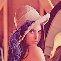
'Lena' is a common image used in the evaluation and comparision of image compression algorithms.
PNG is a simple format that supports transparency and lossless compression. It allows you to define an alpha channel for your image, to mask out transparent areas, as well as an option to enable a lossless Deflate compressor on the data. (Deflate is a combination of two lossless compressors, LZ77, and Huffman). Because compression is lossless, image quality remains identical to the source image, this causes issues however, in that the file sizes tend to be quite bloated, and not as small as they could be.
GIF is another format which supports transparency, alongside animation (which is the direct reason for the whole ‘cats on the internet’ thing..). The GIF format contains two stages of compression, a lossy palletization step (restricting the entire image to only 256 colors) followed by a lossless LZW compressor. The process of quantizing the colors of the image down to only 256 provides an aggressive quality reduction at the benefit of better compression sizes, which tends to produce better compression from the LZW end of things.
If you don’t need transparency, or animation, then JPG is the best format for you. It was generally designed to handle the compression of high-quality photo data, but provides a configurable set of Lossy compression options, allowing you to trade off compression quality vs. image size as your application needs it.
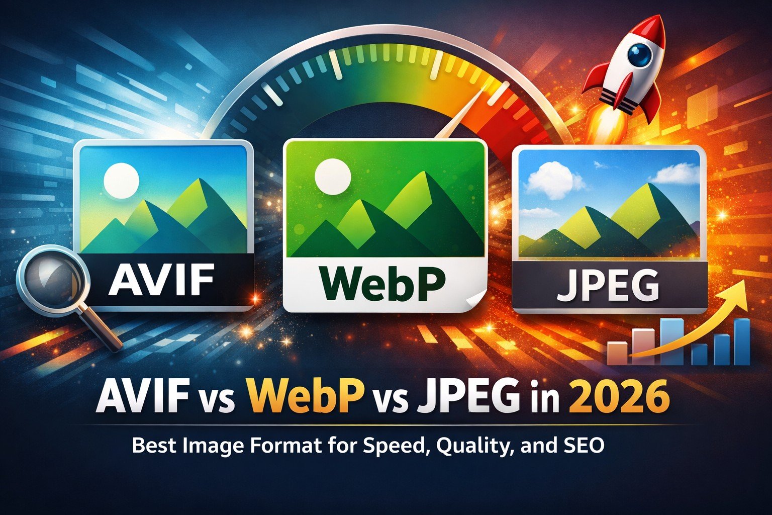
 If you’re looking for more of a ‘one stop shop’ for your image format, then WebP should be on your radar. The format boasts not only superior compression quality/size, but also transparency and animations as well. It uses both a lossy and lossless compressor combination, and much like JPG, will allow you to define your quality level vs. file size. Of course, this new image format hasn't been adopted across all browsers just yet, so web developers who’ve adopted it are currently in the early phases of working through usability issues. Although a 30% savings over JPG, alongside increased server-side adoption prove that WebP is a dominant format for any sites dealing with image bloat problems.
| Compression | Lossless | Lossy | Transparency | Animation | |
| PNG | Good | Yes | No | Full | No |
| GIF | OK | Yes | Yes | Binary | Yes |
| JPG | Good | Yes | Yes | No | No |
| WebP | Great | Yes | Yes | Full | Yes |
Figure 3 - Feature set for specific browser supported formats
Trading Quality for Size
For those image types which have a quality setting that you can adjust, it’s worth noting that the biggest wins you can get is by hand-optimizing the quality setting to get the smallest file. Google Webmaster Help has a great video that walks you through some ways to test quality against your image, and how to test perception properly.
And as imgmin project points out, there’s generally a small change in user perceived quality for JPG compression between levels 75 and 100:
For an average JPEG there is a very minor, mostly insignificant change in *apparent* quality from 100-75, but a significant filesize difference for each step down. This means that many images look good to the casual viewer at quality 75, but are half as large than they would be at quality 95. As quality drops below 75 there are larger apparent visual changes and reduced savings in filesize.
And further goes to show that most large websites tend to oscillate their images around this quality=75 mark for almost all of their JPG images:
| Site | JPG Quality |
| Google Images Thumbnails | 74-76 |
| Facebook full-size images | 85 |
| Yahoo frontpage JPEGs | 69-91 |
| Youtube frontpage JPEGs | 70-82 |
| Wikipedia images | 80 |
| Windows live background | 82 |
| Twitter user JPEG images | 30-100 |
Figure 4 - Average JPG quality level used for top websites
Customizing the settings for each image on your page to balance the tradeoff between quality and size will yield the best savings at the best quality levels. These larger sites tend to have a plethora of images, and generally have no way of hand-optimizing each one, so custom, per-image quality-level adjustment is almost impossible. Some developers have taken a more automated approach to this type of encoding; often taking the output from artists, and running their own heuristics and encodings processes on the images during a build. This type of setup fits a nice middle ground between customization and automation that will help the majority of web developers out there. You can also adopt apps like MiniJPG which will auto-tune your JPG compression level to give the best possible quality.
A quite drastic approach that developers are using to attack image size footprint is to reduce any simplistic icons and images to SVG files, and allow them to be rasterized by the client before being displayed. This type of process trades file-size for client-speed, saving bits on the wire, but incurring more client-side overhead to reconstruct the image when it’s being rendered. As such SVG image format is quite different than the other types of files, in that it is a vector format; meaning that the final image is procedurally generated using shape information defined in the file to a specific resolution of output image. When an SVG image is loaded, it’s converted to a raster format (a 2D array of pixels, like a bitmap) before being displayed.

Figure 5 - An example raster image (on the left) compared to a vector image (on the right) Notice that the vector image is much simpler, and contains less per-pixel detail. This is because the format type does not yield itself to produce high quality data.
Think of SVG as a file format that allows you to store an image ‘description’ at a very low memory footprint, and generate a high-quality, resolution independent image on the client, regardless of the size of the source data. One of the limitations of the SVG format is that it can only represent a certain type of image quality, that is to say that vector images tend to be simplistic, only using a set of primitive types to define how to generate colors on the screen . A field of grass in a prairie for instance, would require too many complex shapes to yield compression savings. Raster images are best used for photos, and other information-dense images, where Vector images are great for things like logos or simple image patterns.
Images quality, sizes and multiple resolution screens.
One of the large issues that developers are facing is the size of monitor pixels against the size of images created. That is, if an author creates image content for a desktop website, there’s a good chance that the image dimensions and quality levels have been tailored to viewing on large, desktop resolution monitors. Mobile devices throw a problem in, however, as their screen sizes are much smaller, and their connections are more expensive. As such, users can be recieving a larger image than they can display, or need.
There’s a few ways to address this issue.
One solution involves precomputing images, offline, for each resolution you need. Most static websites can generate this easily as an offline build step, perhaps resizing the images with toolchains like Grunt. This technique benefits from the fact that images are properly cached on their native device resolutions, and you’re not losing loading time, or transfer cost to get the information to the client. On the negative side, however, is the madness involved with managing this exponential increase in your data set, and the additional logic to send the information to the intended users.
Addy Osmani says:
If you're interested in using Grunt to generate this content, I would recommend trying out grunt-responsive-images for automating the generation of your precomputed images with ImageMagick as part of build.
For those that are tied to Node/Express, express-processimage can be used as an alternative or you could put together a script that calls ImageMagick to generate the images for you.
One of the yet-to-be-solved issues with this approach however, is finding a good solution to manage the increase in your data set. With respect to logic, srcset will hopefully solve this (WebKit as you know have it, Blink intends to implement, FF will once its in iOS).
In the meantime, one could use a polyfill for srcset as a stop-gap.
Another approach, intended for the boom of high-DPI mobile devices, involves playing games with image quality, image dimensions, and client-side cost for image resizing. Effectively, you can store your image at 2x resolution (upscale process), however when you export it to a lossy format, choose a very low quality (resulting in high compression) option. The intention here is to choose a quality level such that the compressed larger image, is smaller than the compressed smaller image.
On the client, you can specify the intended dimensions of the image (which should be less than the current size of the image, since it’s been upscaled). The web-browser will downscale the image to the intended resolution, a process which can blur noise artifacts introduced from the low quality compression value; in some cases, all together.. The end result is a smaller file, that scales to multiple screen resolutions easily, and does not introduce significant quality degradation.
Image sizes, User perception and load times
Looking at the bottom line, the only thing that matters is that a site appears to load fast to users. Appearing faster is being faster, and perceived performance is more important that actual speed.
There’s a two dominant ways to display images over the web.
- Wait for the whole image to be downloaded, and display it once its’ done
- Display part of the image that you have downloaded so far.
No browser uses the first option, simply because it makes the page appears as slow as possible.
The second option is what most of the web is built on now. I’m sure we’re all quite familiar with the style of ‘revealing’ the image from the top-down over time. This is because the images are typically stored in raster order, or rather the first bytes of the image that the browser receives starts at the top-left of the image and moves horizontally across the row. It’s worth noting that if we store our image in a different method, we could change what bits come down the wire first, which changes how the image is seen.
This “progressive” method of encoding can have a beneficial impact to user perception that a page is loading ‘fast’ (note, this is debated, depending on user). This works by encoding a few extra versions of the image, at smaller resolutions which can be transferred faster to the user. This allows the user to see a display of the image that progressively gets sharper as the image downloads more.
Coddinghorror.com has a great example that shows off the visual difference between these two technologies. You can see that the standard method creates a top-down reveal of the image, while the progressive one ‘refines’ the visual as more data is received.
 |
 |
Figure 6 - An example of linear vs. progressive loading for images.
If unicorns aren’t your thing, you can also check out a more in-depth example at Patrick Meenan’s blog, or even try this out on your own images using Patrick’s interactive tool.
Using this property in your image is extremely easy to do : Simply save your GIF or PNG images with the "interlaced" option, or your JPEG images with the "progressive" option. and start making your users love the load times of your website. Although it’s worth noting that progressive images are not supported in all browsers just yet, and loading a progressive image on those platforms can actually cause worse performance.
Images outside the box
The internet is full of brilliant web developers, and no article on image compression would be complete without pointing out some of the great hacks, workarounds, and generally impressive things that these developers have created to allow them to create smaller, higher quality, and impressive images.
Splitting your transparent layer for improved compression.
HTML5 game developers typically send around more image data than your standard website, most of it being transparent frames for a flipbook animation. Sadly that forces these files to use the PNG option in order to get transparency. However a few developers have devised a few work-arounds for images to get better compression and transparency. For example, you can split your color data, and transparency data into two separate image files (two JPGs, for example), and restoring them on the client using a CANVAS element. Although this does increase the number of requests that occur on the network, the savings in image size can be significant for developers who have tons of transparent images on their site (like).
Jake Achibald says:
It’s worth noting that it may be quicker to just use -webkit-mask where you have support for it, rather than doing all this canvas crazyness. Luckily for you, I’ve provided a library to help with this type of thing.
Improve PNG compression through better processing.
PNG’s Deflate option is a lossless encoder, but that shouldn’t stop you from embracing a lossy preprocessor if you want one. Image processing tools like ImageAlpha and ImageOptim, can compress your PNG image in a lossy method as a pre-process before passing it off to the final PNG format. This creates a two-step process where your lossy, and lossless compression are done by two separate applications. The results are impressive, the reduced color space allows the lossless compressor to find, and make, more frequent matches in the file, yielding to better compression.
Once you've exported your PNG, it's time to re-pack your PNG data using advanced compressors to generate a smaller PNG file. Tools like advPNG will take your already exported PNG, and run it through a better Deflate compressor to get a smaller file. Or you could combine PNGOUT with tools like OptiPNG or Zopfli to get the same effect. Of course, each of these systems creates slightly different results, given the input systems, so it may be wise to adopt a system which will compress against multiple compressors and pick the smallest file; If you're feeling lazy, ScriptPNG will do the heavy lifting for you.
Not all animations are created equal.
The SublimeText team launched a website in which they wanted to have a rich animation showing off features of the editor. Rather than using a video, or a standard GIF, they generated a custom animation and packing system to provide great image animation at a much, much smaller size. The technique allows them to display a high-quality animation across multiple platforms without the need for advanced video, or a flash plugin.
More than one way to responsive image.
Since user perception is the most important thing in a website, it’s worth noting that there’s other ways to create ‘perceived’ faster loading websites. Recently, the BBC changed how their site handles responsive images. Their technique allows a smaller image to be downloaded to the client first (so there’s some visibility) and allow the higher-resolution image to be lazy-loaded as needed. You can find a more detailed description of their technique, alongside an open-source version to play with on your own site.
Conclusion
Images are so important, that google even creates a new image format which can leave jpg in dust
Images are a tricky content type that can increase the quality and user perception of your site, but also can undermine your efforts for fast loading, responsive quality. Before you ship your site live, make sure you follow the Image Compression Checklist:
- Compress Images with the right format at the lowest acceptable quality level
- Hand-tune (where possible) your compression quality for all images
- Automate the rest to get the best performance
- Investigate using WebP for all your image needs
- Save your images with progressive options to improve user perception of your pages’ load times
- Investigate other interesting ways to get better compression, or transparency. Think outside the box!
Source: HTML Rocks

 By Jet fitness LLC on 28 February, 2018