What You Should Know About Image Optimization
Balance of Image Quality and Size
You should be changing the settings for each and every image on your web page. Reason is simple: to balance the difference between image quality and size. The process is called image optimization. This ultimately will yield the best savings at the best quality levels. There some larger than life web sites that tend to have a lot of images. Typically they have no way of manual optimizing each image, so custom, per-image quality-level adjustment is almost impossible.
There are some developers who have taken a more automated approach to this type of image encoding. Sometimes they take the output from artists. They run their own heuristics and even encodings methods on the images during a live build. This type of setup is a nice, golden balance between customization and automation. It will help the vast majority of web developers. You can also use sites like Compressman which will auto-tune your JPG, PNG, GIF or WebP compression level to give the best possible quality. There are some image types that have a quality setting that you can change. It is also worth noting that the largest benefits you can get is by manual optimizing the quality setting to get the smallest picture size. Here is a Google Webmaster Help video in which you will learn some ways to test your image quality. And also how to test perception in a right way.
SVG - Image Game Changer?
A whole different method that developers are using to change image size footprint means to reduce any simplistic icons and images to SVG files. This will allow them to be rasterized by the client before being displayed in the browser. This type of process trades file-size for client-speed. It is saving bits of user's traffic. But also uses more of client-side resources to reconstruct the image when it’s being rendered. When you think about it, SVG image format is quite different than the other types of images. Case is that it is a vector format; which means that the final image - or output if you want - is generated procedurally using shape data written in the file to a predefined resolution of output image. When an SVG image is loaded onto web page, it is converted to a raster format (a two-dimensional group of pixels, like a plane or an array) before being visualized.
Take SVG as a file format that generates a very high-quality, resolution independent image on the client's side, noe matter of the size of the original data. But there some limitations. SVG format can only represent a certain type of image quality. Vector images tend to be simplistic, minimalistic. They only use a set of primitive types to define how to reproduce colors on the display. A field full of grass in a prairie has way many complex shapes and forms. It impossible to deal with compression savings in a satisfying way in this situation. Now image optimizatioon sounds like magic, huh?
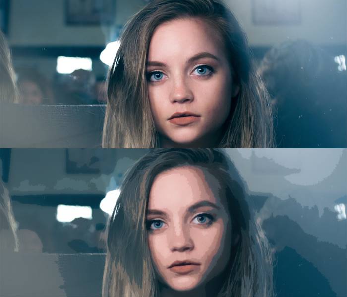
One Image - Multiple Screens and Perfect Quality
One of the largest problems that developers are facing now is the size of display pixels against the size of images. If an content manager creates visual content for a desktop website, there’s a possibility that the image dimensions and quality levels have been created for viewing on big, desktop resolution displays. That's why there is a problem when mobile devices step in. Their screen sizes are much smaller. Also, their connections are more expensive. So it turns out, users can be getting a larger image than their device screen can display. There is no need for this kind of situation.
There are few ways that can deal with this problem. One solution means pre-computing images, while in offline mode, for each and every display resolution you may possibly need. Most static, non-dynamic websites can generate this stuff easily as an offline iteration process, may be resizing the images with some Javascript taskrunners (check out Grunt for example). This exact option gains its benefits from the simple fact that images are correctly cached on their native, original device resolutions. This sci-fi mumbo-jumbo means, that you’re not actually losing loading time or transfer fee to get the image data to the client (and, at the end of the day, to the user). On the other side is the all that crazyness that is involved with handling the exponential increase in your info set and the new logic to send the data to the users that are supposed to get it.
Different Aproach to Image Optimization
Another approach is here for the boom of high-DPI mobile devices. It means playing funny-not-so-funny games with image quality, image dimensions and client-side fee for image resizing online. Fun part is that you can keep your image at 2x resolution (upscale process), but when you export it to a lossy format, you should choose a very low quality (which leads to high compression) option. The goal here is to choose a perfect quality level for image optimization that the compressed larger image, is smaller than the compressed smaller image. Sounds tricky, but worth it.
OK, let's go to the client side. Here you can specify the needed dimensions of the image (remember, it should be less than the current size of the image - because of upscaling process). The web-browser will downscale the image to the needed resolution, Please bear in mind, that this is a process which can blur noise artifacts occured from the low quality compression value; and sometimes even blur them all. The end result is a smaller image file. It scales to multiple screen resolutions easily, without any problems. It also does not create significant quality degradation (sometimes - not at all). Sounds cool, huh?
Image Size Influence on Loading Time and How to Fix It
When a user enters your website or blog, there is only one thing that ultimately matters to him - if a site seems to load fast to users. How do you make sure your site seems to load faster? Well, you make it load faster. Remember, perceived performance is so much more important that the actual speed of webpage loading. There’s a two main options to render your pictures in the World Wide Web. Let's take a closer look at them:
- You wait. Not long - just right until the whole image is donwloaded. Only then you display it, the moment all of the data is on client's side
- You do not wait and render the part of an image you already have downloaded
There are no browsers that use the first option. Why? Well, simply because of it a webpage will take forever to download and render. Then there is a second option for image optimization on website. Have you ever seen how image slowly shows up from top to bottom, so slowly but surely revealing the visuals? You see, pictures are saved in raster order. This means that first you see, well, the first bytes of an image, you go from left to right, from top to bottom. This is the way your browser render any raster image (unless you are reading this from a very distant future). Can we change this way? Modify the apparition of bytes? Sure, we can. We just need to keep image data differently. Everyone calls it the....
The Progressive Method of Image Optimization and Visualization
This “progressive” method of encoding data image can have a really good impact to how user contacts non-verbally with a fast-loading webpage (please bear in mind, this is open to discuss, ot all depend on the user at the end of the day). How it works? Progressive method uses several versions of selected image. It encodes them at smaller resolution - these litttle guys cam be send to user way faster. And what the user sees? The user sees an image, that gets sharper every half-second as the download continues. Progressively, see it now? You are probably thinking now:
Yes and no, not from a jedi. It is really easy to use this method:
Simply save your GIF or PNG images with the "interlaced" option, or your JPEG images with the "progressive" option.
This will allow you to make your users happier. They will love how fast your website is responding now. Also, you should know something - images that are rendered progressively are not supported in all browsers just for now. So, loading a progressive image on some of those platforms can actually be a reason for even worse performance. Be wise.

Bright Future
The World Wide Web is full of wonderful web content creators. They do amazing things with their tech. We think that there is no article on image compression and image optimization that would be complete without pointing out some of the great tricks, sneaky stuff and generally some really impressive things that these guys have created to allow them to create smaller, higher quality, and impressive images. It is Compressman's duty to help them in their mission with its own image optimization tool.

 By Jet fitness LLC on 12 February, 2018
